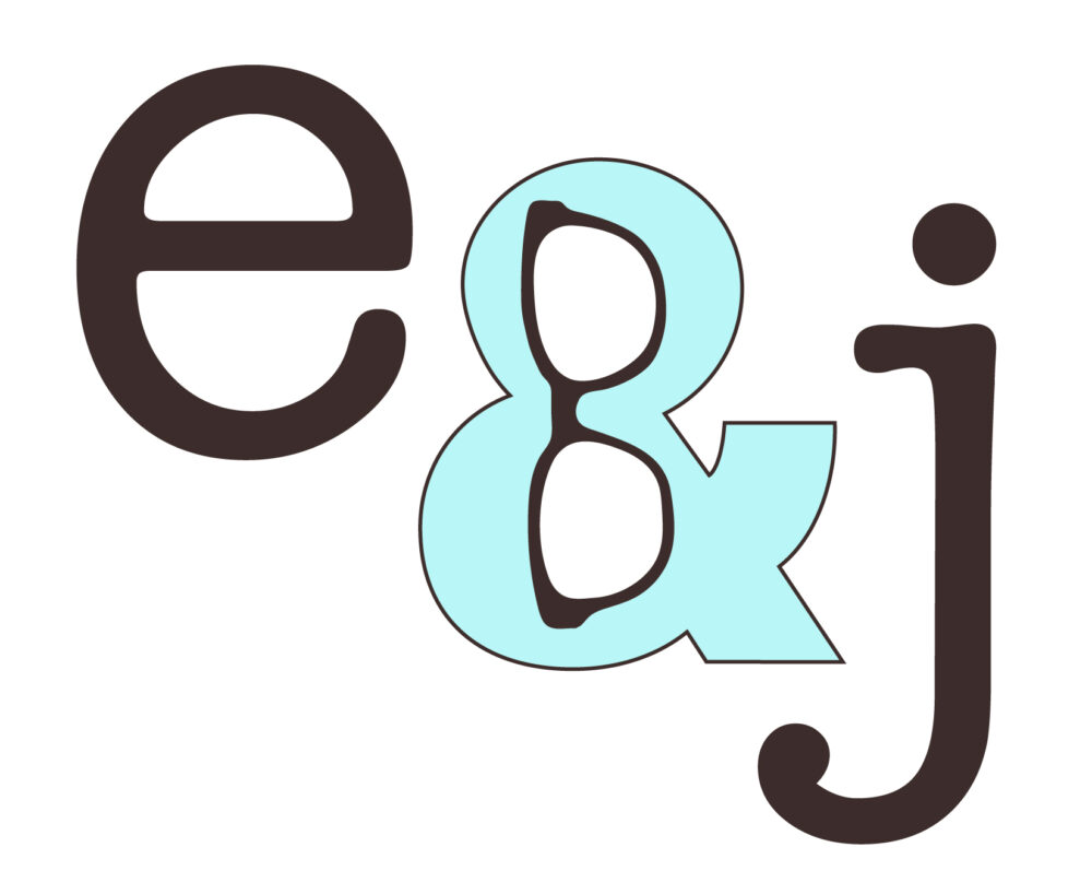
I love how this logo turned out. My client, who is a writer, knew that she wanted to incorporate an ampersand and her signature glasses into the design. These two elements ended up fitting together beautifully. I chose the American Typewriter font, which says ‘author’ to me. I especially like the way each of the letters relates to the ampersand. The ‘e’ echoes it’s figure eight shape and the ‘j’ hugs it perfectly. The diagonal composition emphasizes that same diagonal line in the ampersand as well creating a dynamic layout.

