Horizon Clean Energy Logo
I designed this logo for a clean energy company. We explored many different approaches and finally decided on a simple clean green look to go with clean energy.
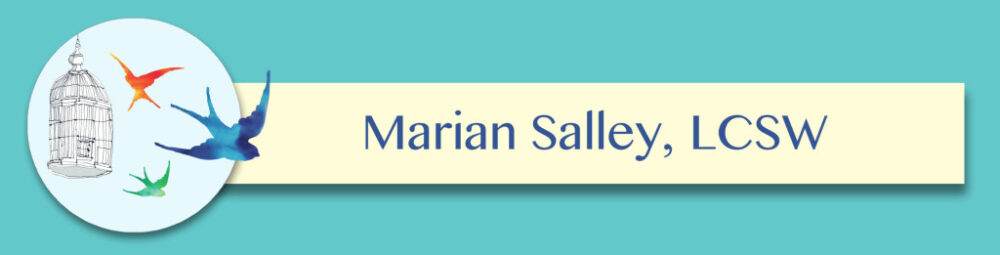
Marian Salley Logo
This therapist asked me to create a logo for her based on an illustration by Annie L. Bailey. She even received permission from the artist. It was fun to reorganize the elements of this drawing to suggest that the birds are gaining freedom from their cage. I used watercolor washes to colorize the birds and a circular format for limitless possibilities. The drop-shadow gives it additional depth. I think the bird that breaks beyond the boundary of the circle is a particularly successful aspect of the design.

Chris Barge Logo
I had so much fun designing this logo for Chris Barge who is running for BVSD School Board. I think it really says ‘schools’ within one second of glancing at it. It will go on yard signs, t-shirts, stickers, promotional materials and campaign mailers.
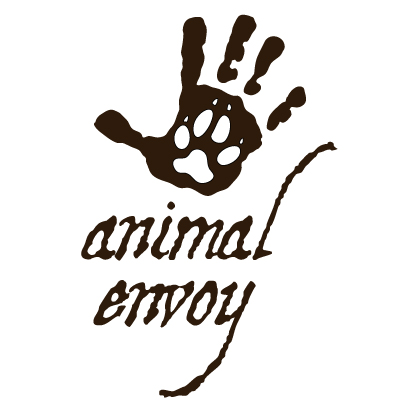
Animal Envoy Logo
This is the logo for a handmade jewelry business that takes its name from a Joseph Campbell quote. The hand print was inspired by ancient petroglyphs and the wolf print embodies our animal nature which ties us to our primitive selves. The font complements the rough outline of the hand and I love how the ‘l’ and the ‘y’ work together to mimic the aspect of the pinky finger.
Rememorate Logo
This logo utilizes fourteen different images and was quite an epic feat to design. It’s for a digital subscription service that stores and organizes family photos and memories. Fun fact: because the original logo was created as a vector image, it can zoom in infinitely without pixelating. So we had fun enlarging the dog’s collar and writing the name of my client’s daughter on the tag. You can’t see that on the web optimized version here but you’ll just have to trust me on this.
Pivotal Parenting Logo
I played with all sorts of bird designs before settling on this pretty flock which seems to illustrate beauty, freedom and liberation. It was fun to draw each bird and to position them in relationship to the text so that they looked forward-moving, randomly spaced and diverse in size.

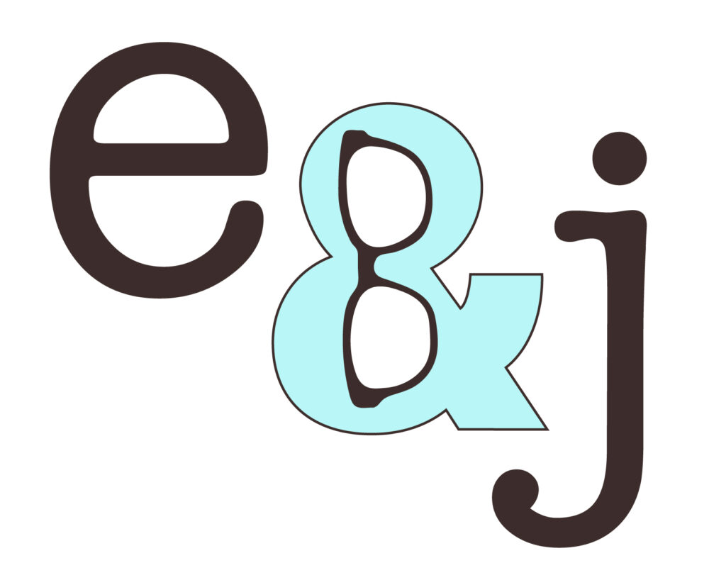
Elizabeth and Jane Logo
I love how this logo turned out. My client, who is a writer, knew that she wanted to incorporate an ampersand and her signature glasses into the design. These two elements ended up fitting together beautifully. I chose the American Typewriter font, which says ‘author’ to me. I especially like the way each of the letters relates to the ampersand. The ‘e’ echoes it’s figure eight shape and the ‘j’ hugs it perfectly. The diagonal composition emphasizes that same diagonal line in the ampersand as well creating a dynamic layout.
Body Beautiful by Julia Logo
It was such a pleasure to dream up this logo for a wellness coach. I loved pairing these fonts and choosing the combination of colors. It was a joy to work with this client who is reliable, decisive and has a great design sense.
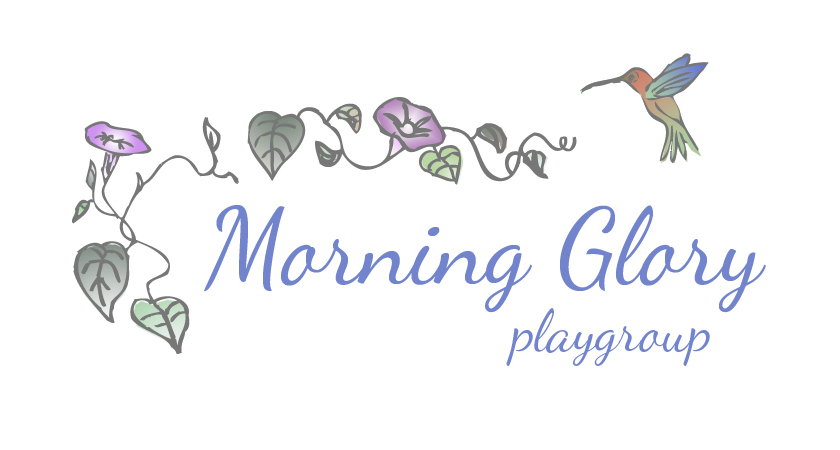
Morning Glory Playgroup Logo
I love designing logos. This one is for a preschool and since its name is Morning Glory I incorporated the flower by the same name. I started the design process on actual paper because there is something organic about sketching by hand. I think it results in more painterly images, while computer graphics tend to be more slick and impersonal. I imported a line drawing into Adobe Illustrator where I added the color gradients and created a finished vector image.
Roadwork Logo
Bistro Sauvage Logo